
| . |
| . |
|
| . |
| Feel free to share these items with family and friends. Follow the directions on how to download this information to your disk. If you wish to use the pattern for other personal use, please see our Usage Notes page. |
The third major descriptor of a color is saturation, also known as intensity. We looked at value and hue in the first two color workshops. A color is described by its hue, value and saturation.
Contents:
Definition
Creating Less Saturated Colors
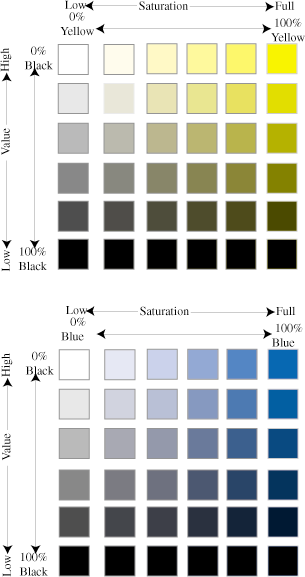
Color Models Describing Saturation
Visual Effects of varying saturation
Practice with Paint
Practice Block - Saturation
Definition
The saturation of a color is the purity of a color. Pure colors are intense, diluted colors are duller.
Creating less saturation
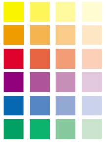
Adding white: A hue that is made less saturated by adding white is known as a tint. When a large amount of white is added we call the color a pastel and when even more is added we call it a blush. The tint of a hue will be higher in value (lighter) than the pure hue and will feel colder. Tints are often associated with morning, spring, air, babies, sweetness or softness.
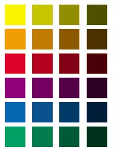
Adding black: A hue that is made less saturated by adding black is known as a shade. A shade of a hue will be lower in value (darker) than the pure hue. Shades of yellow become olive or gold, violets become deep, reds can move toward violet or burgundy and oranges toward brown. Shades of warm colors (yellow, orange, and red) are associated with the fall. Shades of cool colors (purple, blue, and green) add depth and are often associated with night or shadows.
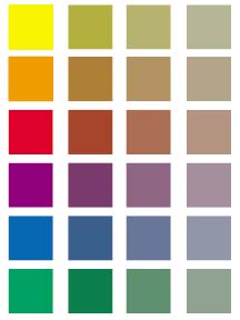
Adding gray: A hue that is made less saturated by adding gray is known as a tone. A tone of a hue can be either higher or lower or equal in value to the pure hue. The lightness or darkness of the added gray will determine the value. The resulting color will be more dull or neutral. Tones can create a foggy, misty or wintry effect.
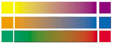
Adding the complement: A hue made less saturated by adding its complement, such as adding orange to blue, to become a more neutral color. Two complements can be mixed to create a gray known as a neutral-gray. Colors created by mixing complements are often rich, subtle and sophisticated. Adding white to these mixtures often produces complex colors.
Color Models Describing Saturation
Johannes Itten created a color star that is an extension of his 12-part color wheel. The star extends the color wheel inward by adding white or creating tints and extends the wheel outward by adding black or creating shades.
Albert Munsell's Color Tree combines the concepts of hue, saturation and value into a three dimensional tree. The trunk is the neutral from white to black. The leaves are a matrix of value and saturation and each hue is a leaf. The colors become more saturated as they move from the center of the tree.
Value and saturation or intensity are often confused. So as a reminder, value is the lightness or darkness of a color and saturation is the brightness or dullness of a color. Two colors can have the same value but different levels of saturation or intensity.
Visual Effects of varying saturation
An area of color with high saturation or intensity appears closer than an area of lower saturation. As an example, look at a landscape or a photograph of a landscape. Portions in the distance show less saturated colors. Colors in the foreground are more intense. Foreground colors also show more contrast. When you are designing a quilt, you can "tell" the viewer which portion of the design is closest to the front by the intensity of the colors you choose.
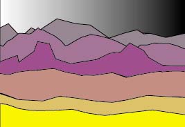
If you use two different colors of the same intensity, such as a red and blue of equal intensity, the surface will appear to be flat. If you use a shade of red (add black), you can create a three dimensional appearance with the shaded area appearing to fall to the back. Likewise, adding a tint of red will make that portion appear to be closer. The use of light and shadow in painting is known as Chiaroscuro.

Colors of high intensity draw the viewer's attention. So use intense colors to bring attention to that part of the quilt on which you wish the viewer to focus.
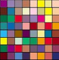
Colors of high intensity also appear larger.
Balance is affected by the proportion of a design that is of intense or saturated colors versus the area that is less saturated in color. A small area of intense color will balance a larger area of duller colors. If you want your design to be balanced and psychologically comfortable, make sure you balance the quantity of intense and dull areas. If you wish to leave your viewer unsettled, manipulate the quantity and placement of intense areas to produce an unbalanced or tense feeling.
If you find that your work in progress is too jarring for your goal, add more unsaturated colors to create a more quiet effect. The less saturated fabrics will tone down your quilt and also take on some of the color from the intense fabrics. You will find that colors that are not completely saturated will add sophistication. A quilt created with pure colors may be suitable for a child, a political or nautical theme but can become garish. Pure colors are appropriate for many things but understand your design objective and choose colors appropriately.
When you wish to create a highlight, try using a tint or tone of your major hue. Likewise, use a shade or dark tone to create shadows. Also try using the neutral-gray for shadow - remember this is the gray created by mixing the complements. Until you practice with colors, it may be difficult to figure out which fabrics these neutral grays might be. If you wish to better understand neutral grays, get yourself some gouache paint (opaque watercolors) and experiment mixing yellow -purple, red-green and orange-blue complements. Take the painted swatches with you to the fabric store to help you choose fabrics.
If you have gouache paint, use them to gain a better understanding of saturation. Paint color swatches for the three primaries (red, yellow, and blue) and the three secondary hues (purple, orange, and green). Then add various amounts of white to each of the hues and paint more swatches. Next add various amounts of black to the six hues. Mix up some light, medium and dark gray and mix each with the six hues. Finally experiment by mixing together the complements. Try adding some white to the complement mixture.
This play with paint will teach you a great deal about color. Keep the color swatches for reference. If you have further interest - see the list of reference books on the page for the last color lesson. Take a trip to an artist supply store. You can purchase little boxes of color swatches. If it is a good store, you may even be able to purchase a kit to make a Munsell color tree. You might also think about investing in a good color wheel.
The practice block provides you with an opportunity to study the subject of saturation by choosing fabrics and making a practice block.
Home
Books | Free
Stuff | Stuff To Buy
Tons o' Links | Contact
© 1998 QuiltWoman.Com All rights reserved.
Questions and comments about this website may be directed to the Webmaster.
